How this collection of 45s went from turntable to typeface, and how you can do it yourself.
Recently I had some down time between projects and decided to do a bit of a personal project. You see, for years, decades even, I have been the caretaker of my Dad’s collection of vinyl records and 45s. There are cases and cases of records, but the unique thing is that all the records are catalogued by hand written notes.
I’ve begun the process of converting these notes into a hand written font that I’m going to give away for free. Sign up here to get the font.
Get the Hand Written Font for Free

It’s now been 20 years since he passed away, and this also would have been his 75th birthday. My idea was to originally catalogue his 45 record collection and create a digital version we could play on Spotify. Then share that playlist with his friends and our family members to enjoy.
About This Passion Project
As soon as I opened the first box, I was reminded of his hand written cards and DJ notes.
You see, my dad would often DJ events or parties at his restaurant for clients and friends. He amassed over a thousand 45s with popular hits of the 50s, 60s, 70s, and 80s.
The more I looked through the cards, I quickly realized between artist names and release dates, I had all alphanumeric characters, A-Z and 0-9. Then there were more obscure song titles and names that gave me a host of other characters like question marks, exclamations marks, parenthesis, and so much more.
I’m going to show you how I created this font so you can make your own fonts.
Creating the Database
Here’s a history lessons for those of you who have grown up in the streaming era. To DJ events at the time, you’d have to lug around crates and boxes of vinyl records to every event. Entire LPs were often too big and cumbersome to deal with. You see, a standard LP has several songs on each side of the record. With 45s, you would have singles. These smaller records would have an A-side and a B-side, usually with one hit song and another song either from the same artist or another artist on the same record label. Many audiophiles will even say that the 45s allow for a wider groove and therefore a better overall sound.
Now this wasn’t the only way to listen to music at the time, 8-track and cassette tapes were also around, but when you are doing live events, you didn’t really have time to rewind tapes and try to find the start and stop points of different songs on the fly, so most DJs still used vinyl. But how do you DJ an event when you have dozens of boxes of records to go through between songs? Well, you can sort by genre and/or artist name. My dad organized hundreds of 45s with hand-written cards that had the song name, artist name, release date, and occasionally special DJ notes for himself to call out over the microphone.
The more I looked through the cards, I quickly realized between artist names and release dates, I had all alphanumeric characters, A-Z and 0-9. Then there were more obscure song titles and names that gave me a host of other characters like question marks, exclamations marks, parenthesis, and so much more. Since he grew his collection over decades, it also meant I have some characters in different pen weights and a lot of variety to work with.
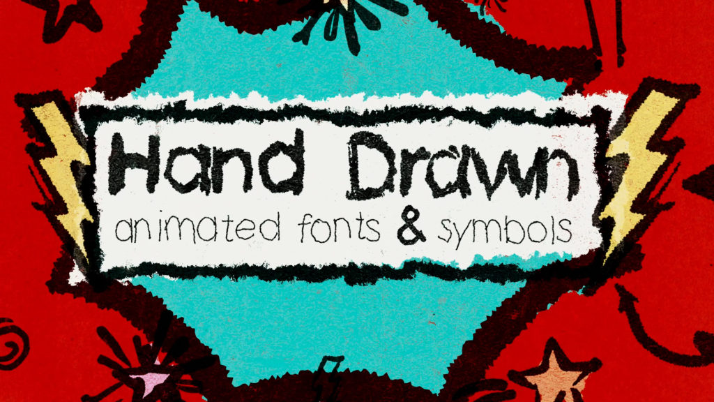
Now if you’ve been following Film Bodega at all, you know we created an animated Hand Drawn pack with some OTF fonts as well. Our parent company, Motion Bodega, has also created dozens of commercials and videos that use custom hand drawn elements and it’s a skill I just have randomly picked up over the years, so I knew I had to get to work creating a font using my dad’s hand writing.
Now, the lazy quick way to do this, would’ve just been to grab a few cards, scan them, and prep them to be a digital font. But I took this “simple” personal project and made it much bigger than it had to be. I spent days going through every single box, logging every single written character (including mistakes), noting which ones had the best characters to scan. Was it overkill? Maybe. Did it make things easier in the long run? Oh yeah.
I created a Notion database that originally logged Song Title, Artist, Year, the Box the card was in, the overall state of the card, and any notes or reminders about standout letters or cards worth scanning. For sanity sake, I had also made the decision to only log the 45s that had a dedicated hand-written card since they were crucial to the font project. I logged 1085 songs, and I easily have another 300+ songs and records that didn’t make the cut.
As I completed each box, I updated the database to include if a song (or a remastered version) was on Spotify and started making the playlist and logging which songs were added and which were not available.
Once all of that was done, I finally got to making the font itself. I looked at my notes in the database and did a first pass marking which cards needed to be scanned and processed. Then I went through each box, grabbed the cards I needed, and scanned them.
Scanning the Hand Written Cards and Letters
Now there are a few ways to do this part, but I needed a system was was relatively quick because I had so many cards to scan, 140 to be exact. Why do I know this? The database, baby! I decided to use an Adobe Creative Cloud workflow, but you can make your own fonts using a ton of different online tools. For this project I went from Adobe Capture > Adobe Illustrator > Fontself Maker.
A few years ago I did a tutorial about Adobe Capture, which was originally a phone app that let you use your phone’s camera to take photos and create vectors and graphics from drawings. Now you can create all sorts of things in Capture like 3D materials, patterns, and more. You’ll need a Creative Cloud account to use the app, and what’s nice is we can send each scan directly into Adobe Illustrator for cleanup and processing.
For the first tests, I setup a table with an overhead light, but I was casting a shadow from my phone so I moved to a vertical setup. I hung up each card on a black background and then tried to evenly light the letters to get the best and cleanest scan. I ended up mounting my phone to a C-stand so my arms wouldn’t get tired and I could just fly through a large number of cards without have to reset much each time.
In Adobe Capture, open the camera and select the Shapes option. Then you will take a picture of the hand writing. That’s… that’s pretty much it.
You see the app will not only take a photo for reference, it will automatically create the vector file for you. I saved and renamed each scan, updated the database, and continued scanning until I completed an entire box. Once I had all the scans I needed, I would open the file on my phone and select the option to “Open in Illustrator” which sent the file to my desktop. Then I just selected the letters or characters I wanted from each scan and put them into a collection of artboards organized by letters, numbers, characters, lines, and words. By the end, I had maybe a dozen options for some letters, and a handful for others. Then came the time to pick the best letters that fit together as a cohesive font.
Creating a Font with Adobe Illustrator and Fontself Maker
Creating a font from handwriting has its own set of challenges. You have to balance keeping authentic to the original drawings, but also making adjustments that are necessary like the angle a characters is written, it’s size compared to other letters, the thickness of a stroke, and more. You’ll also remember that my dad’s collection was created literally over decades. Meaning his handwriting changed slightly in different years, or the pen he used one year wasn’t the same as another.
Overall I decided it was best to create two fonts. One using cards written with a heavy set marker, and another using cards written in pen. The marker provided many more options, allowing for both uppercase and lowercase letters and pretty much every number and character necessary. The pen would be uppercase only with limited characters based on what I had to work with.
The ultimate goal was to preserve as much of my dad’s original writing as possible. For the complete font, I had drawings for every single character except for three. He did not write the @, $, and % characters. I also faced a challenge where some of the lowercase letters are capitalized letters written smaller, so I didn’t even have an “a” to work with, so I took the liberty to create these characters for the font. What’s cool though is that I was able to create each of these using his original markings, so while he didn’t write them himself, those characters still appear using his writing. The $ combines an “S” and an underline, the % with another line and a lowercase “o”, and the @ using an open “o” and lowercase “a”. I was also able to scan a few songs and artists names that used ~ and ` marks so I could take the É and still create an é and á and so on.
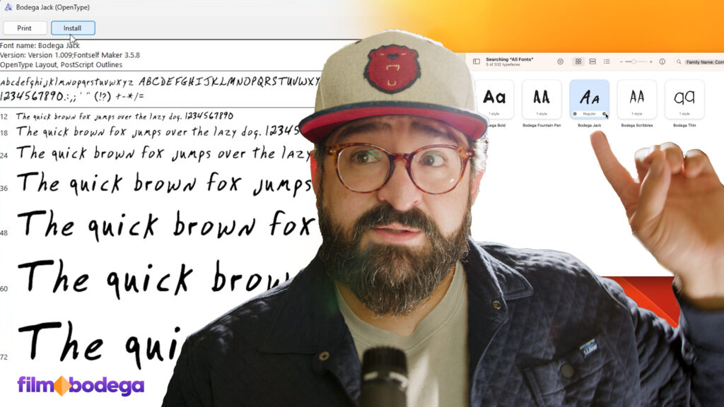
Once I had curated the exact letters and characters I wanted to use, I made sure the were all a similar size and weight. I may have to increase the stroke thickness on a letter to make it the same thickness as others. When everything looked good in the artboard I opened the Fontself Maker extension in Illustrator. Then you just drag each of the characters into the panel and Fontself does all the heavy lifting for you in creating the OTF. Properly name each of the characters and then you can open the Advanced panel and you can see the font in action. Then you can adjust the kerning and position of each character, making sure serifs, characters, or ligatures are in the right place.
Once everything is in place, just save your font as and OTF. Fontself will create the file for you, which you then just need to open and install on your machine. Now you can use the font in documents and apps.
Animating the Font
For this particular font, I decided not to create a write-on animation for each letter like we have done for some of the animated fonts in the Hand Drawn pack because I didn’t want to have to imagine how my dad wrote each character. I just wanted to keep as true to his writing as I could.
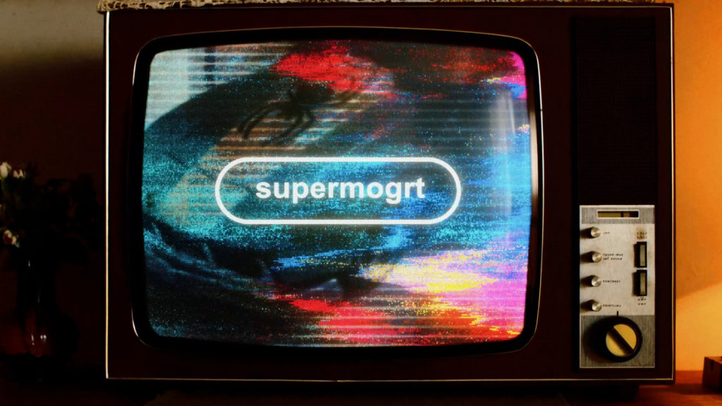
“But Michael”, you may be asking, “how did you animate the version in your videos?” That’s not a true write-on animation, but a wiggle effect I added using SuperMogrt. Using this Premiere Pro template, I can write using the Bodega Jack font, set the color and size, pick an animation, and/or select one of the texture effects. I just added some hand-drawn wiggle to my videos to give it a little bit of life in the edit.
Hand Drawn Animated Fonts & Symbols